2010 Archive
Please keep arms and legs in the vehicle
Back
in July of this year, there was a blog posting that
discussed the first half of the year and what the
second half of the year looked like (1st
Cutting...).
Now at the end of the year, it seems overwhelming to
look backwards. That being said, the point of this
entry will be all about the forward.
If there is one lesson learned in this business, it
is to trust your gut. If it doesn't feel right, it
probably isn't. And if it does feel right, it
probably is. 2011 feels very right.
The new web site is close (and late) to being rolled
out. Products are being refined and some new projects
are already in the queu. It will be very busy and a
lot of work.
But it is still a labor of love and that is what
really matters.
Thank for your support. We are very grateful for our
customers.
The paradox of the Minnesota winter...

Winter in Minnesota is an emotional roller coaster of
love-hate-love.
Winter begins beautifully. It is the whitest white,
very light and very gentle. Everything looks
different and fresh. This is the first 'love'.
This first 'love' will last hopefully through
December. Or until the first day in which the high
temperature doesn't get above zero. Or the first time
you have to jump-start your car. Or change a flat
tire.
This is the first 'hate'.
For six to eight weeks you need to be able to
tolerate this because there is no escaping it. You
can try heading south for a couple of weeks, but you
are only running away from reality. And reality will
be here when you return.
And you know you will be returning.
And then very suddenly, things begin to feel positive
again. Usually it is a bright sunny day in March or
the first time you hear a robin sing, but it is
enough to give you positive momentum. This is the
second 'love'.
Minnesota winters have a sinusoidal rhythm and there
is a comfort in that regularity.
Trains are cool...

It
is difficult to take a bad picture of a moving train.
They are just that photogenic.
Trains are big and powerful. They kick up dust
wherever they go and nothing better get in the way of
a moving train.
Slow your shutter speed down, find a static element
in the foreground and shoot as many exposure
combinations as you can, as quickly as you
can.
Treasure Island family portraits...

This business is project driven. Which means we
become involved in projects, they begin and then they
finish. Some projects have longer life cycles than
others and all projects are unique.
The most current project is a series of family
portraits. The Human Resource department at Treasure
Island Casino has contracted with us to provide
family portraits (photos taken, printed and framed)
for all of their 1,500 employees who want to
participate. At first this might seem like a church
directory project in which the goal is to be as
efficient as possible and creativity is not a factor.
But it isn't, and here is why.
Each family has their own story to tell. There was
the guy who was extremely body conscious, but without
hesitation pulled up his shirt to show me his gastric
bypass scar. Or the young family who had a little boy
with serious skin graft scars all over his body from
a bad burn accident and watching this little guy busy
running around trying to keep up with his older
siblings as much as he could. Or the married couple
who have been married for 55 years and who still
enjoyed ribbing each other with wisecracks. This
photo is a young mom who had just found out she is
pregnant. Her joy is obvious and she is so excited
that she is exaggerating her pregnant belly.
The other aspect was the challenge of using a very
spartan set consisting only of a white vinyl backdrop
and a simple bench and still making every image
unique. It was easy to fall into patterns of using a
common pose that would always work. The challenge was
to slowly add to the repertoire of winning poses by
experimenting.
This project was not especially welcomed at first
because the hours are long and crazy (the casino
operates on a 24 hour basis), but after two weeks of
photography I am really sorry to see it end. The
casino employees are fun and genuinely fond of each
other. The demographics are at the lower end of the
income scale, so it has been especially well-received
perk by the employees.
This has been a lot of fun.
2010 Flyway Film Festival

Once
again we are delighted to be a red carpet sponsor of
Flyway Film Festival. This event is in its third year
and is really beginning to collect some traction. The
quality of the movies this year is very impressive.
The Festival begins on Thursday, October 21 with a
gala event in which the sponsors, directors, actors
and organizers get together, nibble on snacks, drink
some wine and have creative discussions. At the end
of the evening there will be an awards ceremony.
The films begin on Friday, October 22 with the
screening of "Baraboo",
which sounds like a very interesting
film
about life and the hand we are dealt. Over the course
of the weekend, 21 films will be screened.
Details
are at www.FlywayFilmFestival.org.
See you in Stockholm in two weeks!
AmericanPoverty.com and Catholic Charities USA wrap-up...

This
week marks the final chapter of the poverty awareness
photojournalism exhibit entitled "In our own
backyard". This exhibit has crisscrossed the United
States for the past 18 months and next week the
exhibit finishes in Washington DC at the annual
Leadership Summit for Catholic Charities.
Since this is the final and highest profile stop of
the tour, all of the large format images are being
reprinted and remounted, which is close to 120
images.
It is a very moving set of images, that address all
manners of poverty and everyday life. It is really
hard not to stop and soak up the texture and realism
of each image.
This has been a challenging and gratifying project.
One of the best parts of this project has been
working with Steve Liss. He is a natural-born
educator and an amazing photojournalist who gets
right into the thick of it. Please visit his web site
at: SteveLiss.com.
Time for a Max Becherer update...

It
has 18 months since the last Max Becherer update.
Just to refresh, we came to know Max five years ago
when we hosted his photojournalism exhibit entitled
"Through the lens; Life in Iraq". Max has been in
Iraq since the very beginning of the conflict
(remember "shock and awe"?) and has seen action in
Iraq, Afghanistan, Pakistan and Gaza.
Max
has since gotten married and splits his time between
Cairo, Egypt and California when he isn't in the
field. He is still a combat photojournalist and he is
still extremely talented. Max's work has been
featured in Newsweek, Time, The New York Times, The
New Yorker, US News and World Report and Men's
Health.
Recently Newsweek Magazine asked Max to retrace the
Iraq invasion in reverse, using his photos. That
feature can be found
here.
After you visit that site, please visit Max's
website and
enjoy his talent. It is rare to see photography this
deep in the action.
Russell Patterson, 1893 - 1977
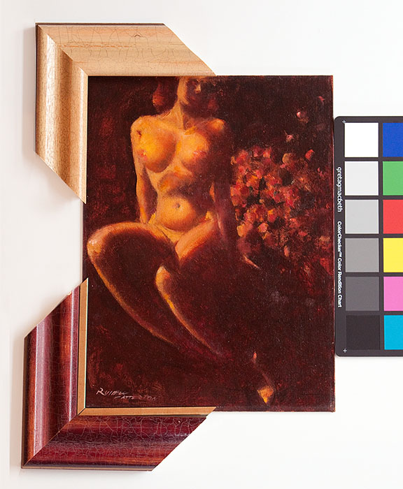
Half of the fun of framing (and it is very fun) is
researching the art. This was a piece that was
recently acquired in an art auction and this artist
merits the research.
The piece is entitled "Nude & Flowers" from 1964
and painted by Russell Patterson. It is 12"x16" and
it is an oil on hardboard.
Patterson
was a fascinating personality who lived from 1893 to
1977. He began his career as a magazine illustrator
working for Vogue, Vanity Fair, Cosmopolitan and
Redbook. During this period he achieved celebrity
status as an illustrator of beautiful women.
In the early 1930's he became restless and decided to
become a Broadway costume designer for several
successful Broadway productions. By the end of the
1930's he had moved to Hollywood to work on scene and
costume design.
Again he became restless and developed a comic strip
called 'Mamie', which became a Sunday syndicated
cartoon that ran for six years. The Mamie character
was glamorously portrayed, which leveraged his
artistic talent and his sense of fashion.
By the 1960's he reverted back to being a fine art
artist, but was not above exploiting his celebrity
status by being a judge for Miss America and Miss
Universe pageants and endorsing Medaglia D'Oro coffee
and Lord Calvert whiskey.
Patterson was a renaissance man who grew up in the
public eye. He enjoyed new challenges and he
especially enjoyed his high profile status in the
media.
Now the challenge becomes how to best frame this
original that does this artist justice.
Cartooning...

Tentative
arrangements have been made to host an art exhibit
later this year that will feature the work of
contemporary cartoon artists. Britt Aamodt is a
friend and her book will be released at about the
same time as the exhibit, which is driving this
exhibit. Her book will be available at the Minnesota
Historical Society Press and can be found at this
link.
The intention is to invite several artists, exhibit
some large format cartoons, have a cartooning Q&A
and a book signing in an event spread out over three
venues (Best of Times
Bookstore, The Sheldon
Theatre mezzanine gallery and at our gallery).
You might be asking yourself if cartooning is a
legitimate art medium. It is and I would suggest you
keep the comment to yourself, lest you become the
parodied target of an offended cartoonist.
Therein lies the beauty of cartooning. It can either
lampoon or glamorize their subjects. It can be
humorous or it can be brutally and uncomfortably
frank. It can address real life or it can fabricate
an entirely new universe with it's own laws of
physics. In other words, cartoon art defies
definition.
This exhibit promises to be a lot of fun. I grew up
reading the comics and I still read the comics. I
love the comics.
This is completely consistent with past exhibits,
including the Brown & Bigelow Pin-up exhibit in
2007, the Cream of Wheat original advertising art in
2008 and the original pulp magazine cover art in 2009
(see the illustration trend going here?). Details as
they unfold.
1st cutting...
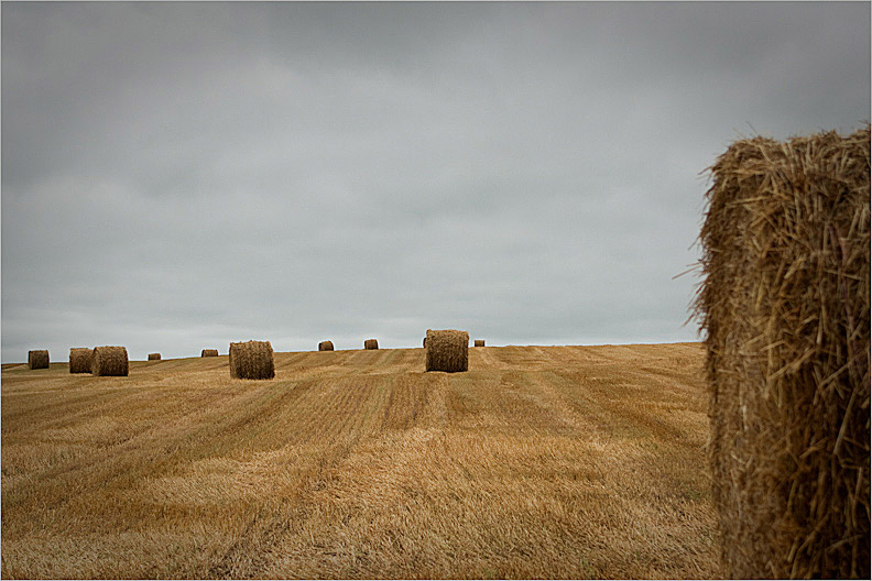
July
in Minnesota means the first hay cutting of the
season. In a normal year, most farms will have two
cuttings and then leave some winter ground cover for
the critters. The first cutting will have the most
yield, but it isn't until the second cutting that the
break-even point is reached.
For a farmer, the first hay cutting is an opportunity
to reflect on the business (year-to-date), and also
project the business going forward for the rest of
the year. Stretching this metaphor to a
near-absurdist level, it isn't that much different in
the art industry.
Business is up and the industry is cautiously
optimistic. The nature of the business has changed
and the types of projects have also changed.
Anticipating what those changes will be and
responding to those changes are some of the biggest
challenges a small business owner will face.
We will continue to evolve, but we will also continue
to provide the things we enjoy most about being in
this business.
A new web based product is under development and
should be available before the end of the year (the
evolving thing). There are also discussions taking
place regarding an original art exhibit in the
November/December timeframe (the enjoyment thing).
And of course, thank you for your patronage. Art is
good.
Finally, a chance to use 'ubiquitous' in a sentence...
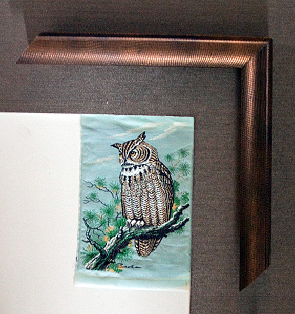
Cash's
(sometimes called J&J Cash) is a UK company
located in Coventry, England. Cash's has been
producing silk embroidered bookmarks, luggage and
clothing labels and name tags for over 150 years. You
might assume something as ubiquitous as a clothing
label would not merit museum level custom framing.
But you would be wrong.
Cash's produces a product that is clearly motivated
by quality and pride in craftsmanship. It is
genuinely a work of art, much in the same vein as a
beautifully machined watch. A labor of love, so to
speak.
This is a silk embroidered horned owl, which is part
of a limited run of coniferous forest animals Cash's
produced. Other varmints include a peregrine falcon,
an otter and some wood ducks. Each piece is about the
size of a business card and each will have their own
frame.
Cash's is currently producing a series of
Beatrix Potter silks, which is a perfect visual
for the embroidery medium. And the price is very,
very reasonable.
Richard Nixon, the everyman

In
1969, friends of Richard Nixon paid for and had a two
lane bowling alley installed in the lower level of
the Executive Office Building. Nixon was an avid
bowler and spent quite a bit of time at this bowling
alley over the next five years. He had been known to
bowl up to twenty games without a break.
Ollie Atkins was the official White House
photographer and snapped this photo in 1970. Later
that year, Nixon's White House staff used this photo
to demonstrate that Nixon was not out of touch with
the average citizen, and in fact was just like any
other citizen.
It later achieved iconic status because of a single
scene from the 1998 film "The Big Lebowski".
There is a tremendous amount of public domain imagery
available from the US Government, some of it
noteworthy and historically significant. Some of it
kitschy. Since it was paid for with tax dollars, it
really is owned by the public.
Charley Harper, 1922-2007
It was three years ago today that Charley Harper
died.
Charley was a very unassuming artist from Ohio. He
began his career as a book illustrator and over time
migrated to a wildlife artist. But not the typical
wildlife artist. Charley used his graphic art skills,
his penchant for precision and his sense of humor to
portray the natural world like no other artist ever
has.
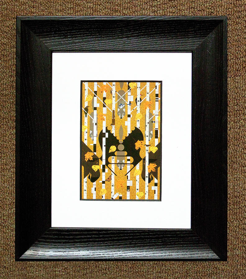
This piece is called "Isle Royale" and incorporates
exactly what a birch tree forest feels like. You
might think you are alone, but there are probably
dozens of different eyes watching you at any given
moment.
Goodbye Charley. You are missed.
Bully Pulpit hiatus...

This note is being added after the fact. May was a
nearly overwhelming month between work, a
mini-vacation, graduations and non-profit activity.
In lieu of posting anything of substance, here is a
photo that was taken in May.
Grand Marias, MN on May 24, 2010. The fog was very
thick and the air was very gray. Probably not a good
idea to stand in the middle of the road, but it was
awesome.
Going ultra-wide

Because
the sensor in a digital SLR camera is typically
smaller than the 35 mm film that it replaced, the
physics of the focal point of the lens are changed.
This is known as "The Field of View Crop Factor" or
sometimes "The Focal Length Multiplier". The net
result means your long lens becomes longer and your
wide lens becomes narrower.
Wildlife photographers sing the praises of The Focal
Length Multiplier because their 200 mm telephoto lens
effectively becomes a 320 mm lens. Creative
photographers hate it because now a 24 mm lens
becomes a 38 mm lens and you can never get wide
enough.
My personal lens investment is from the pre-digital
era, so I never had the chance to compensate for this
effect. All of my lens became too long for many of my
purposes. I satisfy my need for wide by occasionally
renting a 14 mm ultra-wide lens (effective focal
length of 22 mm), which reminds me of the good old
days, when a wide lens was truly a wide lens.
Wide is a lot of fun and it also allows me to keep
the header imagery fresh.
Penumbra

The definition of penumbra is 'almost shadow' or
'almost dark' (or light). Penumbra is typically used
to describe events in astronomy, such as when an
eclipse occurs.
In photography, penumbra is a unique opportunity to
capture texture and atmosphere in an almost
occult-like light. A strip club has always struck me
as kind of sad and desperate. I have been meaning to
take this photo for years but the highway has been
re-routed and it is especially tricky to get to. This
isn't exactly the effect I was looking for (drizzle
and water puddles would have been ideal), but I liked
the emotion the headlights provided.
Jake's strip club is located in Coates, Minnesota. It
had a litigious relationship with the community and
for years the town continually passed laws to close
it down. In 2002 the Minnesota Supreme Court ruled
finally that the town was within it's authority to
close Jake's. In an unwise effort to vote the local
politicians out of office, Jake's owner had 92
patrons (sometimes called rummy's) fill out voter
registration cards, using the strip club as their
home address.
You don't mess with the feds. It is never a good idea
to break federal voting fraud laws and especially in
such a stupid manner. Several hundred thousand
dollars later, the case was finally settled. The bar
never did reopen and it has been vacant ever since.
No doubt it will be torn down and the opportunity to
capture Jake's in penumbra light will be gone
forever.
The missing piece...
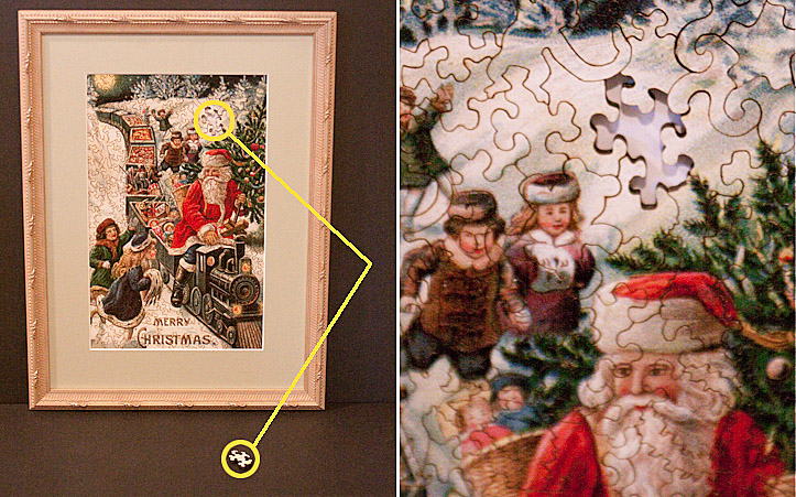
Many
years ago, a very good framing customer brought in
this beautiful antique jigsaw puzzle to be framed. It
was from the turn of the 19th century and the
construction itself is a work of art. The pieces are
scroll sawed and several pieces themselves are shaped
as children's toys (monkeys, toy soldiers, etc.). It
is a remarkable example of craftsmanship.
The
only problem was that a single piece of the puzzle
was missing. This seemed very tragic and because of
the depth of the puzzle, it was as obvious as a
missing tooth on a beautiful model in a toothpaste
ad. But, it is what it is, and since it had been in
her family for many, many years, it was decided to
frame it up regardless, as is.
Jump ahead several years to the present...the
customer removes a drawer from a dresser and
low-and-behold the missing puzzle piece reappears
from behind the drawer.
There is something very therapeutic in knowing that
the missing puzzle piece will soon be reunited with
its brothers and sisters and now the picture is
complete.
The Lord works in mysterious ways.
Yoshitomo Nara

Yoshitomo Nara is a 51 year old Japanese pop artist
that has been influenced by anime and punk
rock. His sculptures seem cartoonish in nature
and are typically animals or children. Very
often his subjects will have contradictory elements
such as weapons or accusatory looks that belie their
wide-eyed expressions.
The
interesting thing about Nara is his
consistency. Artists like Nara have this
pursuit of the same relentless vision regardless of
the critics. Nara says he is helpless in this
matter because he is compelled to create
them.
This
fiberglass sculpture is called “Your Dog” and is part
of the permanent collection at the Minneapolis
Institute of Arts.
The traveling photojournalism exhibit

It
has been a full year since we became involved in the
Catholic Charities American Poverty photojournalism
project. It has been a rewarding and challenging year
and now a certain rhythm takes place as the exhibit
crisscrosses the United States. This coming week the
exhibit presents itself in Nashville, Tennessee. The
map above demonstrates where the exhibit has traveled
(in red) and where it is yet to travel (in blue).
Additional cites might still be added and no final
confirmation yet if the final exhibit will take place
at the White House.
Steve Liss is the Project Director and will travel to
each city immediately prior to the exhibit reception
and artfully and tastefully documents the slices of
poverty unique to each community. Our job becomes
image preparation (printing, mounting and packaging)
all of the images for each exhibit and delivering
them directly to the exhibit venue. Usually there
isn't a single day to spare and thankfully UPS has
delivered each and every package on time and in
perfect condition. Ideally there would be a larger
buffer of time for production, but then, what would
be the challenge in that?
It is a challenge and from every challenge you hope
you learn and improve from the experience. The
official web
site is worth a visit. It is very well
done.
Put up or shut up!

Over
the years and after working with countless artists,
it is easy to forget what an artist really goes
through when they exhibit their art. They open
themselves up for critical review and there is
significant exposure on the part of the artist. They
might be appear to be nonchalant or even
over-confident about exhibiting, but inside their
stomach acids are working overtime. For me, it was
time to put up or shut up.
The 'Foot in the Door' exhibit is different in this
regard. It is completely democratic, because if it
fits in the box, it exhibits. Consequently, it
becomes much less about the art and more about just
being able to exhibit and have fun. I submitted a
photograph I took ten years ago. it is entitled
"Midnight on Mason Street". It was taken in San
Francisco and the image exposure was on the neon leg.
This severely underexposed the rest of the image and
you are left with these two illuminated signs on
opposite sides of the street. It is a gimmick photo,
but I am partial to gimmicks. I was raised on comic
books and my favorite part was always the
Johnson-Smith page on the inside back cover (x-ray
glasses and such). The clearinghouse of gimmicks.
My favorite image from the exhibit has to be the seed
art tribute to wrestler Baron von Raschke. Classic.

The story arc of the Marc Chagall project continues...
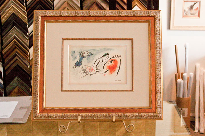
Just to refresh...a customer had rescued this
original Marc Chagall linoleum lithograph from slowly
being destroyed by the mounting and the framing
(please see:
"How to commit art murder", or, "I ruined a
masterpiece, but saved on the framing"...). The
mats were leeching acid into the art paper, the
non-UV glass was allowing the sun to fade the art and
the mdf frame was slowly dissolving the art with
formaldehyde out-gassing.
The rescued piece will be picked up by the customer
today and some type of ceremony will take place to
present the art back to the public library. I thought
I would share the design details of this project:
It is a double rag mat design (100% acid free) with a
filet. The bottom mat is a 1" reveal (this is a
museum standard for a design with a filet) and the
top mat is a 3.25" reveal. The art paper had some
waviness and it is loosely held in place with
archival corners on the backside. This allows the art
to breathe and respond to the ambient temperature.
The outside moulding is called an Amante design and
is a classic moulding style. The glazing is a museum
quality UV glass, which is almost imperceptible. It
was decided not to conceal the staining from the
previous mats and try to work the flawed feature into
the overall design.
It looks very classy and is totally reversible for
future framers in the event of a re-design.
Respect the art. Protect, preserve and present the
art.
More about 'Foot in the Door 4'


I
love the Minneapolis Institute of Arts. I know that
is not a profound observation for anybody who has
ever visited the MIA, because anybody who has ever
visited it, also falls in love with it. It is a
friendly and welcoming arts atmosphere (which isn't
as common as you would hope), the art is terrific and
it is free. What's not to love?
Be that as it may, the 'Foot in the Door 4' is
shaping up nicely. I had the chance to visit a second
time before the public unveiling. The total
submissions were beyond all estimates and the lines
were long for nearly the entire four day submission
period. The final number is a closely guarded secret
until the public reception, but sources close to the
count have provided a range of between 4,700 and
5,000 entries (compared to 1,700 submissions ten
years ago, the last time this exhibit took place).
Three large gallery rooms will be filled and the raw
expression of creativity is almost overwhelming.
I managed to find my piece and two of the three
pieces I had submitted on behalf of friends and
offspring. It looked as if about half the art was up
and I did hear that all of the art had been
photographed for the online gallery.


Behind the scenes of 'Foot in the Door 4'


This
job provides for a couple of perks, one of which is
being involved in interesting art exhibit projects
from a 'behind the scenes' perspective. In other
words, friends in the art world ask you to volunteer
to help them with an event. Yesterday was a perfect
example.
Every 10 years (this being the fourth time), The
Minneapolis Institute of Arts hosts an event called
the "Foot in the Door" exhibit. Essentially, any
Minnesota resident, at no expense to themselves, can
submit one original piece of art they have created to
be exhibited at The Minneapolis Institute of Arts.
The art cannot be larger than 12"x12" for wall art or
larger than 12"x12"x12" for three dimensional art. It
is a terrific opportunity to exhibit in one of the
most prestigious museums in the world for four
months.
Art check-in takes place over four days. As a
volunteer for the art check-in, my responsibilities
were 1) insure the art did not violate the size rule,
2) collect the paperwork for each piece, 3) assign a
wall location, 4) provide a receipt for the art and
then 5) deliver the art to the staging area. In other
words, the first point of contact for the artists.
The art itself was impressive and the range was
amazing. Each piece was cradled by the artists as if
it were a newborn.
After the art is received, it is staged in an exhibit
room and waits to be registered in the computer and
photographed for the on-line catalogue. Over 1,000
artists checked in art the first day and over 3,000
submissions are expected. At the peak crowd size, the
wait was 2.5 hours, but everybody was extremely
patient and in a very good mood.
One of the other perks in volunteering is checking in
your own art (and your friend's art) without the
complication of waiting in line. Those will be posted
later.
Today my back is killing me (marble floors) and I am
exhausted. It cost me a day's pay to be there and the
tuna sandwich was stale when I finally had a chance
to eat. But I made many new friends and saw many
familiar friends and would do it again in a New York
minute. I can't wait for the exhibit reception which
is on February 18, 2010.


Does this guy ever stop talking about the new bandshell??
Apparently
not.
In any case, it is time for a Red Wing Central Park
Band Shell follow-up.
This time last year, the park was a mess. Frozen and
snow-covered dirt piles were scattered all over the
site. It looked like a project that was going to miss
the July 4th deadline. But the Red Wing Construction
company is very professional and proud of the product
they deliver. The 4th of July deadline was met with
days to spare.
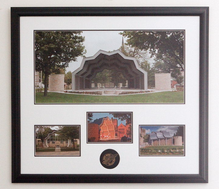
After the project was finished, Red Wing Construction
presented The Jones Family Foundation (the
benefactors of the band shell to the City) with this
beautifully framed momento. It is a 36"x32"
multi-opening custom framed piece of the band shell
from all different angles and during the very first
performance. It also includes a custom embossed mat
of the Red Wing Construction logo.
We were proud to provide all of the photographs, the
printing and the framing and we have since built a
few of these pieces for Red Wing
Construction.
A good gig

January
is usually a quiet month in the art and framing
industry. There might be a small bump in business
because of some Christmas follow-up framing, but that
trickles away pretty quickly.
This January was an exception. Several projects came
in the door because of fiscal calendar years that
started January 1st. Another major Catholic Charities
project was delivered, this time for a Centennial
Leadership Summit in San Jose, CA. This was the
largest venue so far (this being the 4th) and it will
move across the United States every month until
September, where hopefully it will exhibit at the
White House. Go to
www.AmericanPoverty.org to get the most current
updates. I love working on this project because it
leverages the power of photography and it is an
absolute adrenaline rush in meeting the tight
deadlines. In this business, this is known as a 'good
gig'.
We also had our first order from Turkmenistan. To be
more precise; Ashgabat, Turkmenistan. This is a
former Soviet Union republic that declared
independence in 1991. It was a nice sized order of 10
large format mounted images and one extremely large
canvas print. There is a sense of satisfaction in
knowing your handiwork is on the job in some remote
part of the world.
On an unrelated note; Downtown Mainstreet agreed to
co-sponsor a photography competition with Red Wing
Framing & Fine Art Printing. It is always fun to
have too much to do.
And finally, if nothing else I learned a long time
ago to surround yourself with very smart people. Or
at least stand close to them.
I am uber-excited about a new project that some very
smart people I have come to know are advising me on.
This is on a six-month timetable, so the details will
roll out over time.
How to commit art murder, or, "I ruined a masterpiece, but saved on the framing"...
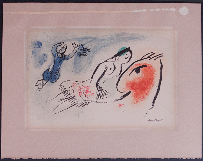

This
is very tragic, but thank God a good samaritan
rescued the art.
This original Marc Chagall lithograph had been
donated to the local library. Many years ago,
somebody made the decision to frame this
irreplaceable art with the cheapest framing solution
available. This included a cheap mdf frame with
standard glass and paper mats. To further insult the
art, the art was glued to the back of the mat.
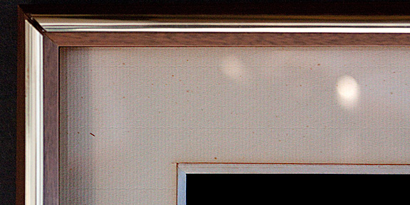
So,
let's summarize how this art was nearly ruined;
1) The frame was made from a cheap mdf material which
out-gasses formaldehyde (an effective way to dissolve
art),
2) The glass provided no UV radiation protection from
the sun so fading is inevitable,
3) The mat was a cheap paper mat with acids that
leeched into the art and foxing (bacteria) is growing
on the paper,
4) The glue. Sigh, don't even get me started about
the glue.
A biological, chemical and radioactive attack on the
art. A true WMD from an art standpoint.
Friends don't let friends frame drunk.
Be that as it may, it is an amazing piece of
creativity.
Chagall
was
a Jewish Russian-French artist who lived from 1887
until 1985. He was a giant in the art world and an
early innovator of Modernism. It really is inspiring
to examine.
We are working on a new and completely archival frame
design. I will post it when the project is
finished.
Ode to Element...

Admittedly
it might seem odd to write a haiku to a vehicle, but
I feel I owe it at least that, especially since I am
about 2,000 miles behind my scheduled oil change.
The 2006 Honda Element has been a beast for me (in a
good way). It is the perfect art transport vehicle.
Once the rear seats are removed, there is almost 73
cubic feet of very rectangular space, which is
perfect for hauling art upright. It is very
dependable and practical. On the downside, it is a
bit cold blooded and the passenger ride is somewhat
upright.
So, in lieu of an oil change (maybe next week) and in
the tradition of 5-7-5 haiku rhythm:
Ode
to Element
A square can roll round
Even in Winter
Happy
new year!
