The Red Wing Framing Gallery Panel Print
And now, a word from the sponsor...
For years, people have been complaining that, "if they can put a man on the moon, why can't they put a print on a panel?"
Introducing the Red Wing Framing Gallery Panel Print.
It's a Panel! It's a Print!
It's a Panel Print!
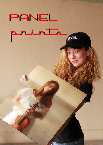
It begins with any digital photo
and ends with a full-print bleed, UV-protected, 1/4"
thick hardboard panel print that is
pool-table
flat and rugged!
The Panel Print has a linen laminate finish and a 1"
reverse frame mount. The mount lays flat on the wall
and the print is an elevated surface that creates a
modern 'drop-shadow' effect on the wall.
It can be printed at any size or aspect ratio (great
for panorama photographs) and it has been especially
popular with photographers who appreciate this very
contemporary look. It also works great for commercial
projects that are restricted from using glass or need
to cover large wall surfaces, yet still need to
project elegance and creativity.
Call the shop today at 1-651-385-0500 and create your
own art from your own images!
Now, back to the regularly scheduled programming.
Word of the Day:
Pugnacious.
1) That which is about the mannerisms and/or characteristics of the pug-nosed dog. E.g., "That dog is sure pugnacious!"
2) George Will.

Anatomy of an Exhibit
The entire exhibit process was documented, so if we let T = the actual exhibit time (4 pm, 04-20-2009), then T-x is some amount of time before the exhibit. Think of the television show '24', except instead of saving the country from terrorists with nuclear weapons, we are hanging art (the lamest metaphor to date on the entire internet).
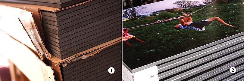
1)
T-2 weeks: Once the project is defined, the supply
chain of raw materials begins to fill up. This
exhibit required two cases of 4'x8'x1/2" black
Gatorboard.
2) T-1 week: Each image was printed on a premium
luster photo paper (a wide color gamut, scratch
resistant, but susceptible to fingerprints), vacuum
mounted to the Gatorboard and then trimmed to size
and packaged. 50 images were printed and mounted for
this exhibit.
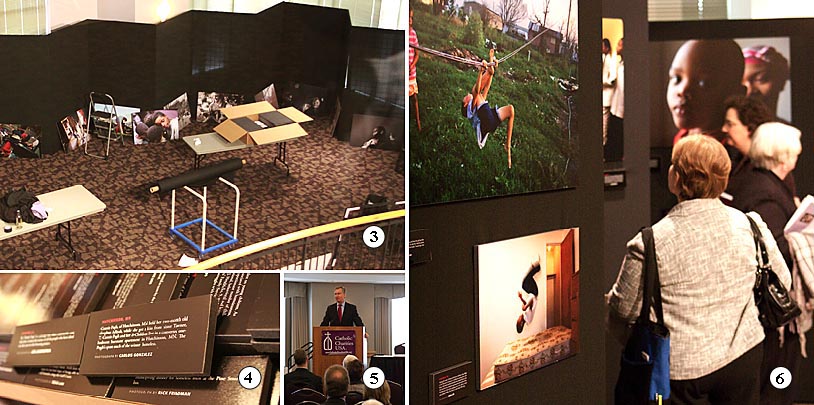
3)
T-24 hours: The finished materials were delivered the
day before the exhibit opening. The exhibit panels
were problematic for a few reasons, but the image
layout was deemed the most critical.
4) T-12 hours: The image title blocks completed the
story-lines. I was delighted to see that Carlos
Gonzales from the Minneapolis Star Tribune was
participating. I came to know Carlos from the Max
Becherer exhibit.
5) T- 4 hours: No exhibit is complete without a
politician. In this case it was the Honorable Mayor
Chris Coleman of St. Paul.
6) T- 0 hours: This exhibit generated a lot of
discussion. A 'first person, photojournalistic' style
was used.
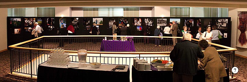
7)
T+x: From St. Paul, the exhibit moves to Portland,
Oregon and then begins a nine city nationwide tour,
with the goal of ending at the White House in 2010.
Math,
art and terrorists in a single blog entry. Now that
is efficient blogging.
The Shell takes shape...
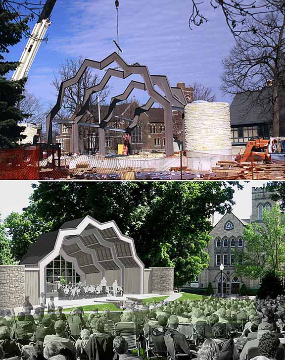
The
Central Park Bandshell took a big leap forward
yesterday when the crane arrived to install the
ironwork. The entire back wall will be glass, so the
bandshell will be inviting from both sides. The roof
shape is supposed to create a better acoustical
environment. The rendering on the bottom image is the
architectural orthographic projection.
The actual audience will not be semi-transparent.
Stewy's on Main
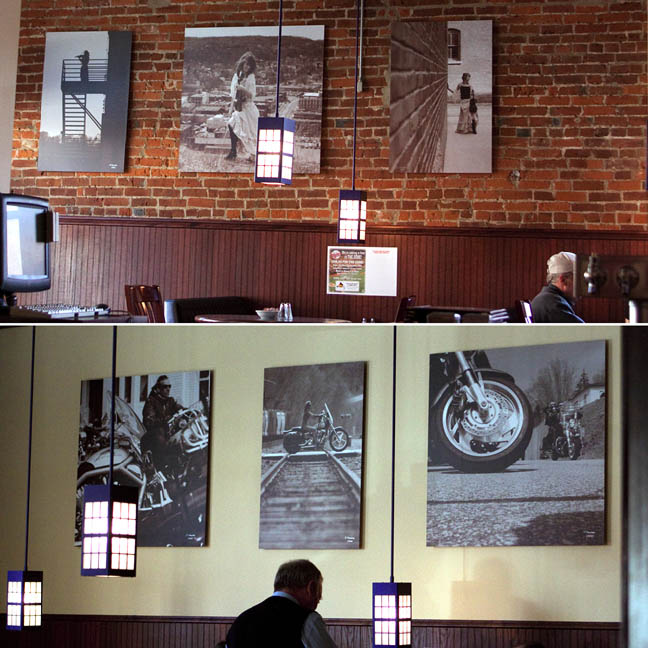
Another
restaurant opened in Downtown Red Wing. Stewy's on
Main will serve breakfast, lunch and dinner and
provide a full bar offering.
Stew approached us a month ago and gave us free reign
(with his final approval) to design attractive wall
images . It was decided to focus on local iconic
scenes, with a focus on both sides of the Mississippi
River.
Panel Prints are used. This is a print on hardboard
and mounted with a reverse frame to create a wall
stand-off and laminated with a linen finish. The
beauty of this product is that it is very
contemporary, pool table flat, no glass is used and
it creates a very nice drop-shadow effect. Each image
is either 40"x40" or 27"x40".
The first grouping of three are all Downtown Red Wing
photos, with the common denominator of the
violin-playing model. These were printed with a brown
sepia tone.
The second grouping is from the Maiden Rock Flood Run
in 2004. Same image tone, different effect.
One wall is all about elegance and grace and the
other wall is all about machines and chrome.
Yin and Yang. Joanie loves Chachi.
Mr. Pin-up...
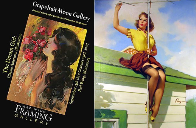
The
Minneapolis Star-Tribune did a nice story today about
Dan Murphy and his illustration art collection. We
had the pleasure of working with Dan and Sarah on two
different occasions; once in 2007 for The Dream Girl
exhibit and again in 2008 for The Cream of Wheat
exhibit.
Dan has a terrific collection and is a recognized
expert of this genre. I look forward to working with
Dan again this year, maybe with a pulp men's magazine
(think True Detective) or a science-fiction exhibit.
The Strib article can be found
here
Red Wing Photography Club Exhibition of Photographs
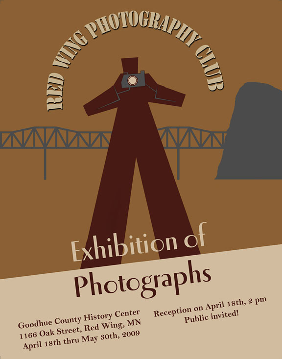
On
April 18th, 2009 at the Goodhue County History Center
(1166 Oak Street, Red Wing, MN) the Red Wing
Photography Club will present an Exhibition of
Photographs.
Ardent readers will remember that this club was
formed about this time last year. This is the first
time this club has formally exhibited members’
photographs. Assuming there isn't a like-wise repeat
of the Rolling Stones incident in Altamont, CA, it is
likely this group will exhibit again.
The rules were pretty simple: no more than three
pieces and nothing larger than 16"x20". And like most
good photographers, the rules were almost immediately
broken.
It
is a non-juried, non-themed, non-competitive,
not-for-sale exhibit. The objective is for
members to share their favorite images and for many
members to exhibit for the first time.
A public reception is April 18th at 2 pm at the
History Center.
I did the poster layout. It is absolutely derivative
of a wpa poster from the 1930's (read: rip-off).
You're welcome and thank you.
