
A letter from the White House
A very good customer (and friend) recently received this hand-signed letter from President Barack Obama.
It was a very touching letter and it discussed equal rights and marriage. The President included the White House photograph.
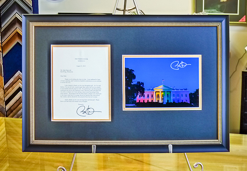
Wow. Just wow.
Creative prompt...
Or, what triggers creativity for you?
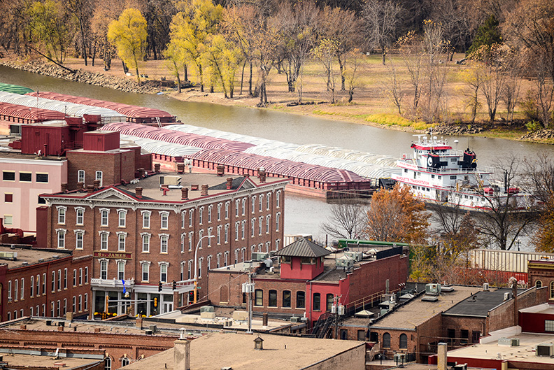
The Red Wing community is blessed with many beautiful assets that can all trigger creative responses.
We have a beautifully preserved downtown, the Mississippi River, The river bluffs and all kinds of authentic working elements (the barges, the railroads and the manufacturing).
This time of year is especially creative because of the changing of the seasons and the longer autumnal light.
Blood chit
This is one of those peices that come through the shop that really makes you pause and reflect.
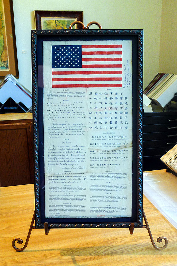
"I
am a citizen of the United States of America. I do
not speak your language. Misfortune forces me to seek
your assistance in obtaining food, shelter, and
protection. Please take me to someone who will
provide for my safety and see that I am returned to
my people. My government will reward you.”
This is the first paragraph written in English and
this is repeated in 13 languages. It is called a
blood chit and it is from the Vietnam War (1968).
A blood chit is a prepared message carried by
military air crews and by other service members
deemed to be at what the military calls “high risk of
isolation". It is written in local languages that a
lost service member can present to most anyone who
might help.
It is printed on silk for durability and was
distributed immediately before a dangerous mission.
Blood chits originated in England 200 years ago and
was introduced to US military during WW II. It has
been used during the Korean conflict, the Vietnam War
and through both Middle East conflicts.
Master Certified Picture Framer
Valerie Becker was recognized as a Master Certified
Picture Framer this month by the Professional Picture
Framing Association.
This is a significant accomplishment in the picture
framing industry and demonstrates a skill and
knowledge set of picture framing at the highest
professional standard.
Valerie was the first in the state of Minnesota to
accomplish this accreditation and one of only 60
Master Certified Picture Framers in the world.
Congratulations Val!
You can read more about it at the press release.
Big plans for 2014
Happy
holidays!
Since the topic is big plans, it just seemed fitting
to show an example of one of the smallest projects we
have worked on.
2013 was a challenging year. There were several
things that did not materialize as planned and there
were several large projects that we were proud to
participate in.
We have several exciting plans for 2014. It is a bit
premature to announce anything yet, but the wheels
are in motion already and we are very optimistic and
excited for the new year.
Equipment investment
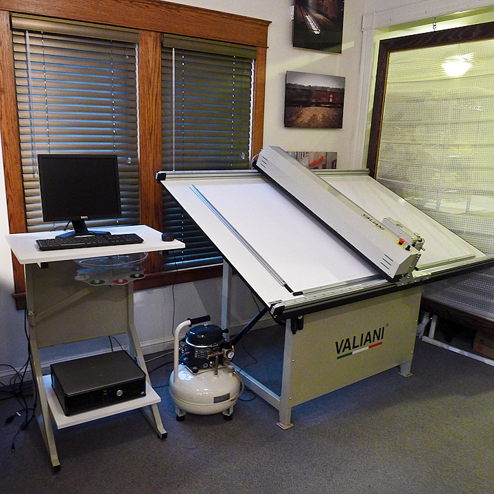
We have been using a Gunnar computerized mat cutter
since the shop opened in 2002. This equipment has
easily paid for itself both in terms of productivity
and quality. The Gunnar is a Swiss-made piece of
equipment and it has never failed us.
But the dependency this has created is not a good
business practice. If this equipment were to fail, we
would have to resort to hand-cutting the mats. We've
done this before and it works, but it is slow and
manually cutting a mat is an easy thing to screw up.
That being said, a computerized mat cutter is an
expensive piece of equipment. It doesn't pay to
purchase cheap equipment if it is going to fail or
become inaccurate.
We opted for a Valiani. The Valiani is a substantial
piece of equipment. It is larger and more rugged than
the Gunnar is and it is of Italian origin.
Italian engineering is much different than Swiss
engineering. The Swiss like minimalist design and the
Italians like over-engineered designs.
We intend to keep the Gunnar and use the Valiani for
larger projects.
2013 resolutions...
1) I will enjoy the buffet.
2) I will come back again. Thank you as well.
3) I will not smoke and be younger than the age of 16
as I dispense fuel.
4) I will floss twice a day, every day, the entire
week before my next dental exam.
That's all I got.
=============
Actually, 2013 is ramping up to be a very ambitious
year for several reasons.
Life is not simple, but it should be enjoyed.
Creativity is a uniquely human delight that drives
this enjoyment.
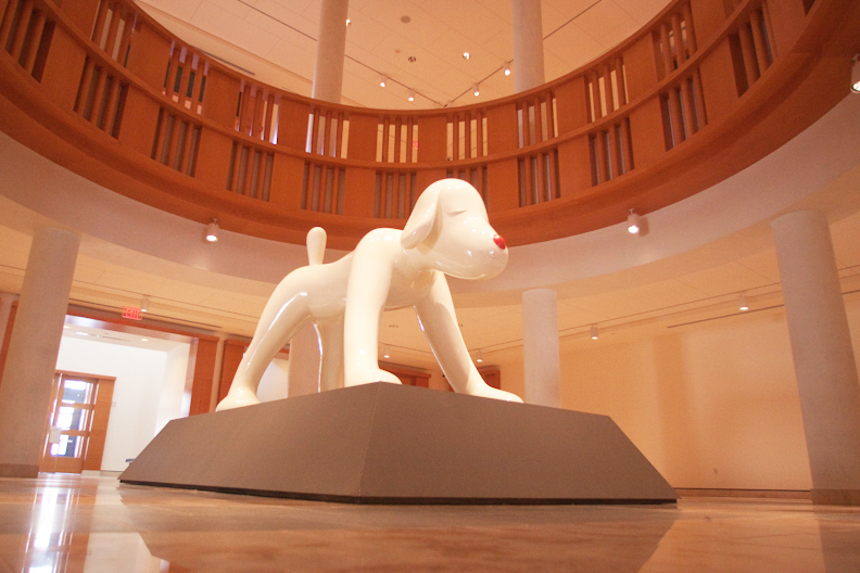
"Your Dog" by Yoshitomo Nara is a personal favorite.
It is in one of the rotunda galleries of the Minneapolis Institute of
Arts.
It completely captures how the world must look from a
child's perspective. You cannot help but enjoy this
and feel the wonderment of it all.
Happy new year!
Catch-up/ketchup
We have been very busy re-inventing here at the shop.
To begin with, we have been very focused on slowly
unveiling Red Wing
Digital. Red Wing Digital is a print-on-demand
product that provides unique large-format
presentation products, namely the
Panel Print and the
Acrylic Print. The Acrylic Print is slowly
getting ready for production, but it has taken longer
than hoped.
Secondly, we have a new business partner. Fine Art
Prints on Demand is a United Kingdom company.
This is a side of the business (printing and framing
fulfillment) we have been quietly working and growing
for a number of years. FAPoD is our third customer
for this side of the business.
These two developments have driven our third
initiative. We are moving our production to a larger
facility. We have narrowed our options down and
expect to be able to make some final decisions
shortly.
On the topic of work, road trips & writer's block
It
has almost been six months to the day that this blog
has been updated. This is inexcusable and
consequently here are the excuses;
1) It has been very, very busy at the shop. The crush
began in August (the last blog posting) and has been
unrelenting ever since. The simple solution would be
to hire additional help to manage the workload and to
some degree that was the solution. But as a business
survivor of 2008 (remember Lehman Brothers?), you
learn not to trust short term business trends. So you
suck it up, put in long hours and satisfy each and
every customer.
2) Contributing to this work crush has been the
success of the new products at RedWingDigital.com.
This is a new business model for us and it takes time
to hammer out a smooth workflow. But if it were easy,
everybody would be doing it. Look for new products
soon.
3) It is supposed to be quiet in January so we closed
the shop for ten days and took a long road trip to
the most remote part of the United States that we
could find. However, this January was the busiest
January ever even with ten days removed from the
calendar. It isn't fair to have a customer wait for
my vacation, so it meant even longer days once we
returned.
4) This stuff doesn't write itself, especially when
you are tired and have convinced yourself you have
writer's block.
That being said, I promise not to allow that kind of
break in the blog pattern to ever occur
again.
Our customers are rock stars!
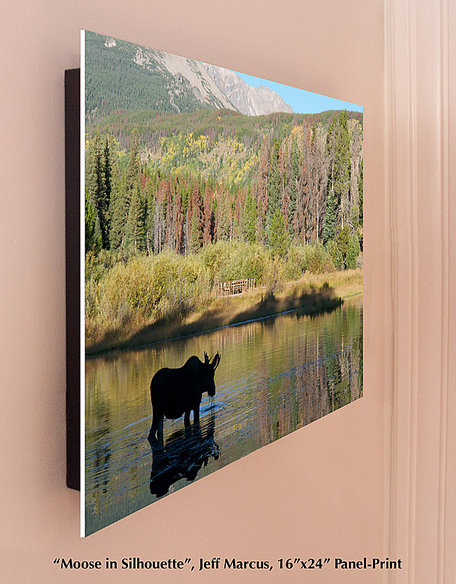
This business is only as good as the customers and we
have the best customers.
Case in point; the busier we get, the less attention
web administration seems to get. But it is too
important to ignore for very long. This morning I was
determined to bring the Video/News
section of this web site current (go check it out).
This involves the painful task of writing press
releases, proofing them and then re-writing them. I
know it isn't as bad as breaking rocks for a living,
but it is still a job that I do not look forward to.
At some point you need to include testimonials to add
some credibility to the releases. And this is when I
am reminded how good my customers are.
Thank you Jeff Marcus. You have been a steadfast
supporter for many years and we appreciate it. Now go
support Jeff at his web site White Light
Photography. This is good stuff.
1st Half of 2011...
The
end of June signals the end of the first half of the
year. Last year was a good year and so far this year
is ahead of last year. The business mix has changed
over the years and we have been fortunate to be well
positioned to leverage the change.
Red
Wing Digital has been a significant time and
money investment up until this point. There are still
a few issues that need to be worked out, but the
product inventory is now in place and the details
regarding product design have been finalized. The
orders have been increasing at a nice and realistic
rate. Packaging and shipping issues are being
addressed now and we are always looking for more
production space.
This is our 10th year of business and we have been
tracking business patterns since the very beginning.
Invariable the second half is quite a bit busier than
the first half, for a number of reasons.
The bottom line is that we owe everything to our
loyal customers. Thanks again.
Please keep arms and legs in the vehicle
Back
in July of this year, there was a blog posting that
discussed the first half of the year and what the
second half of the year looked like (1st
Cutting...).
Now at the end of the year, it seems overwhelming to
look backwards. That being said, the point of this
entry will be all about the forward.
If there is one lesson learned in this business, it
is to trust your gut. If it doesn't feel right, it
probably isn't. And if it does feel right, it
probably is. 2011 feels very right.
The new web site is close (and late) to being rolled
out. Products are being refined and some new projects
are already in the queu. It will be very busy and a
lot of work.
But it is still a labor of love and that is what
really matters.
Thank for your support. We are very grateful for our
customers.
Treasure Island family portraits...

This business is project driven. Which means we
become involved in projects, they begin and then they
finish. Some projects have longer life cycles than
others and all projects are unique.
The most current project is a series of family
portraits. The Human Resource department at Treasure
Island Casino has contracted with us to provide
family portraits (photos taken, printed and framed)
for all of their 1,500 employees who want to
participate. At first this might seem like a church
directory project in which the goal is to be as
efficient as possible and creativity is not a factor.
But it isn't, and here is why.
Each family has their own story to tell. There was
the guy who was extremely body conscious, but without
hesitation pulled up his shirt to show me his gastric
bypass scar. Or the young family who had a little boy
with serious skin graft scars all over his body from
a bad burn accident and watching this little guy busy
running around trying to keep up with his older
siblings as much as he could. Or the married couple
who have been married for 55 years and who still
enjoyed ribbing each other with wisecracks. This
photo is a young mom who had just found out she is
pregnant. Her joy is obvious and she is so excited
that she is exaggerating her pregnant belly.
The other aspect was the challenge of using a very
spartan set consisting only of a white vinyl backdrop
and a simple bench and still making every image
unique. It was easy to fall into patterns of using a
common pose that would always work. The challenge was
to slowly add to the repertoire of winning poses by
experimenting.
This project was not especially welcomed at first
because the hours are long and crazy (the casino
operates on a 24 hour basis), but after two weeks of
photography I am really sorry to see it end. The
casino employees are fun and genuinely fond of each
other. The demographics are at the lower end of the
income scale, so it has been especially well-received
perk by the employees.
This has been a lot of fun.
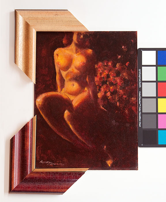
Russell Patterson, 1893 - 1977
Half of the fun of framing (and it is very fun) is
researching the art. This was a piece that was
recently acquired in an art auction and this artist
merits the research.
The piece is entitled "Nude & Flowers" from 1964
and painted by Russell Patterson. It is 12"x16" and
it is an oil on hardboard.
Patterson
was a fascinating personality who lived from 1893 to
1977. He began his career as a magazine illustrator
working for Vogue, Vanity Fair, Cosmopolitan and
Redbook. During this period he achieved celebrity
status as an illustrator of beautiful women.
In the early 1930's he became restless and decided to
become a Broadway costume designer for several
successful Broadway productions. By the end of the
1930's he had moved to Hollywood to work on scene and
costume design.
Again he became restless and developed a comic strip
called 'Mamie', which became a Sunday syndicated
cartoon that ran for six years. The Mamie character
was glamorously portrayed, which leveraged his
artistic talent and his sense of fashion.
By the 1960's he reverted back to being a fine art
artist, but was not above exploiting his celebrity
status by being a judge for Miss America and Miss
Universe pageants and endorsing Medaglia D'Oro coffee
and Lord Calvert whiskey.
Patterson was a renaissance man who grew up in the
public eye. He enjoyed new challenges and he
especially enjoyed his high profile status in the
media.
Now the challenge becomes how to best frame this
original that does this artist justice.
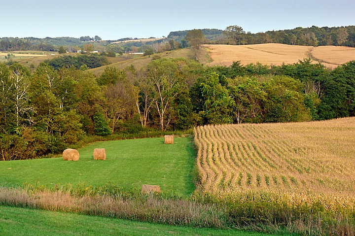
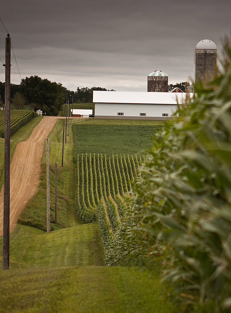
1st cutting...
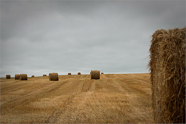
July
in Minnesota means the first hay cutting of the
season. In a normal year, most farms will have two
cuttings and then leave some winter ground cover for
the critters. The first cutting will have the most
yield, but it isn't until the second cutting that the
break-even point is reached.
For a farmer, the first hay cutting is an opportunity
to reflect on the business (year-to-date), and also
project the business going forward for the rest of
the year. Stretching this metaphor to a
near-absurdist level, it isn't that much different in
the art industry.
Business is up and the industry is cautiously
optimistic. The nature of the business has changed
and the types of projects have also changed.
Anticipating what those changes will be and
responding to those changes are some of the biggest
challenges a small business owner will face.
We will continue to evolve, but we will also continue
to provide the things we enjoy most about being in
this business.
A new web based product is under development and
should be available before the end of the year (the
evolving thing). There are also discussions taking
place regarding an original art exhibit in the
November/December timeframe (the enjoyment thing).
And of course, thank you for your patronage. Art is
good.
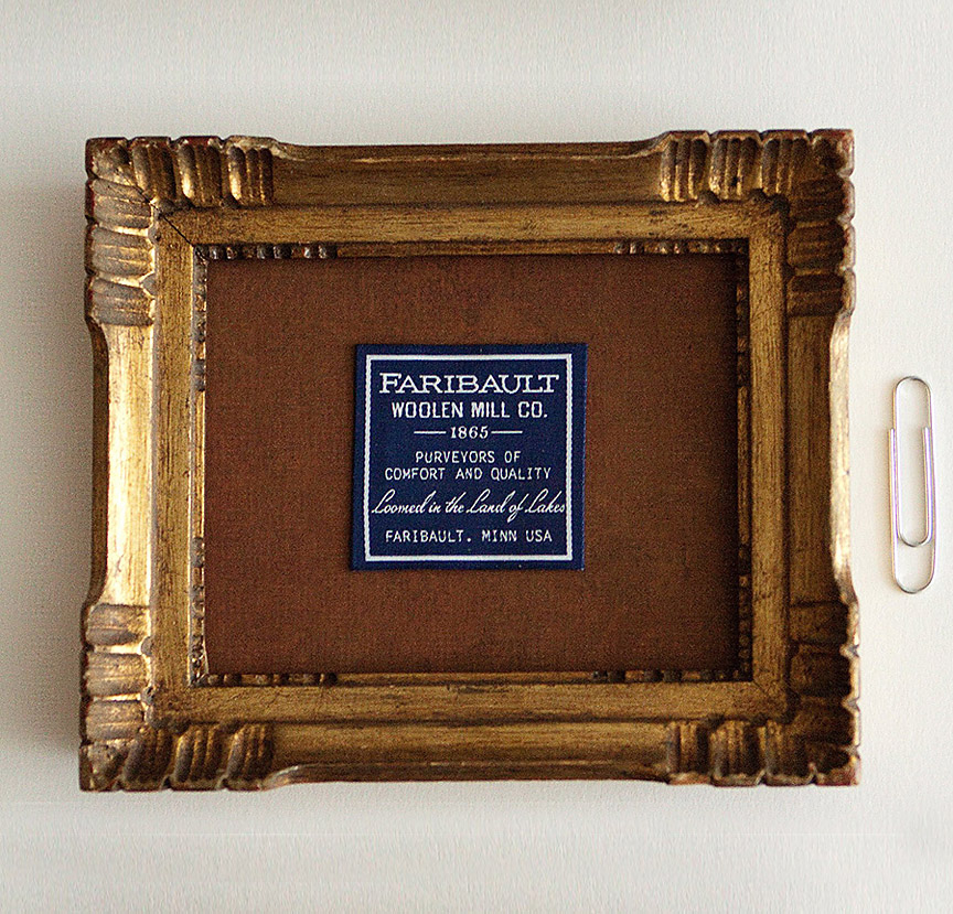
Finally, a chance to use 'ubiquitous' in a sentence...
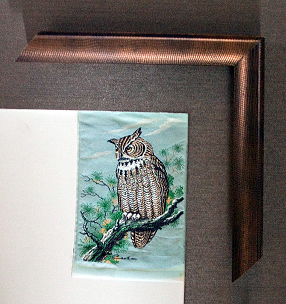
Cash's
(sometimes called J&J Cash) is a UK company
located in Coventry, England. Cash's has been
producing silk embroidered bookmarks, luggage and
clothing labels and name tags for over 150 years. You
might assume something as ubiquitous as a clothing
label would not merit museum level custom framing.
But you would be wrong.
Cash's produces a product that is clearly motivated
by quality and pride in craftsmanship. It is
genuinely a work of art, much in the same vein as a
beautifully machined watch. A labor of love, so to
speak.
This is a silk embroidered horned owl, which is part
of a limited run of coniferous forest animals Cash's
produced. Other varmints include a peregrine falcon,
an otter and some wood ducks. Each piece is about the
size of a business card and each will have their own
frame.
Cash's is currently producing a series of
Beatrix Potter silks, which is a perfect visual
for the embroidery medium. And the price is very,
very reasonable.
Charley Harper, 1922-2007
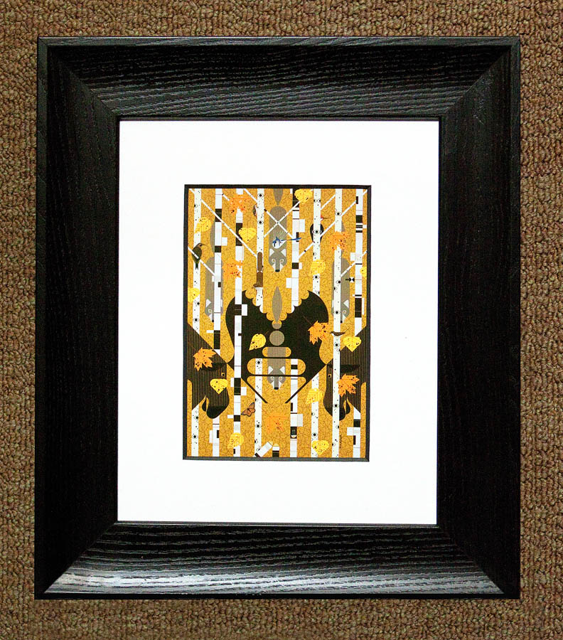
It was three years ago today that Charley Harper
died.
Charley was a very unassuming artist from Ohio. He
began his career as a book illustrator and over time
migrated to a wildlife artist. But not the typical
wildlife artist. Charley used his graphic art skills,
his penchant for precision and his sense of humor to
portray the natural world like no other artist ever
has.
This piece is called "Isle Royale" and incorporates
exactly what a birch tree forest feels like. You
might think you are alone, but there are probably
dozens of different eyes watching you at any given
moment.
Goodbye Charley. You are missed.
The missing piece...
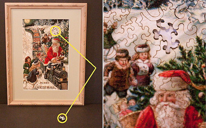
Many
years ago, a very good framing customer brought in
this beautiful antique jigsaw puzzle to be framed. It
was from the turn of the 19th century and the
construction itself is a work of art. The pieces are
scroll sawed and several pieces themselves are shaped
as children's toys (monkeys, toy soldiers, etc.). It
is a remarkable example of craftsmanship.
The
only problem was that a single piece of the puzzle
was missing. This seemed very tragic and because of
the depth of the puzzle, it was as obvious as a
missing tooth on a beautiful model in a toothpaste
ad. But, it is what it is, and since it had been in
her family for many, many years, it was decided to
frame it up regardless, as is.
Jump ahead several years to the present...the
customer removes a drawer from a dresser and
low-and-behold the missing puzzle piece reappears
from behind the drawer.
There is something very therapeutic in knowing that
the missing puzzle piece will soon be reunited with
its brothers and sisters and now the picture is
complete.
The Lord works in mysterious ways.
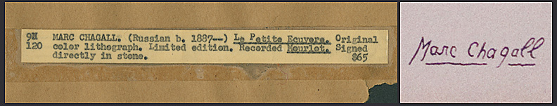
The story arc of the Marc Chagall project continues...
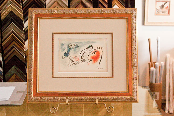
Just to refresh...a customer had rescued this
original Marc Chagall linoleum lithograph from slowly
being destroyed by the mounting and the framing
(please see:
"How to commit art murder", or, "I ruined a
masterpiece, but saved on the framing"...). The
mats were leeching acid into the art paper, the
non-UV glass was allowing the sun to fade the art and
the mdf frame was slowly dissolving the art with
formaldehyde out-gassing.
The rescued piece will be picked up by the customer
today and some type of ceremony will take place to
present the art back to the public library. I thought
I would share the design details of this project:
It is a double rag mat design (100% acid free) with a
filet. The bottom mat is a 1" reveal (this is a
museum standard for a design with a filet) and the
top mat is a 3.25" reveal. The art paper had some
waviness and it is loosely held in place with
archival corners on the backside. This allows the art
to breathe and respond to the ambient temperature.
The outside moulding is called an Amante design and
is a classic moulding style. The glazing is a museum
quality UV glass, which is almost imperceptible. It
was decided not to conceal the staining from the
previous mats and try to work the flawed feature into
the overall design.
It looks very classy and is totally reversible for
future framers in the event of a re-design.
Respect the art. Protect, preserve and present the
art.
Does this guy ever stop talking about the new bandshell??
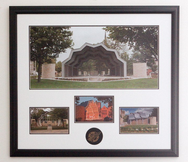
Apparently
not.
In any case, it is time for a Red Wing Central Park
Band Shell follow-up.
This time last year, the park was a mess. Frozen and
snow-covered dirt piles were scattered all over the
site. It looked like a project that was going to miss
the July 4th deadline. But the Red Wing Construction
company is very professional and proud of the product
they deliver. The 4th of July deadline was met with
days to spare.
After the project was finished, Red Wing Construction
presented The Jones Family Foundation (the
benefactors of the band shell to the City) with this
beautifully framed momento. It is a 36"x32"
multi-opening custom framed piece of the band shell
from all different angles and during the very first
performance. It also includes a custom embossed mat
of the Red Wing Construction logo.
We were proud to provide all of the photographs, the
printing and the framing and we have since built a
few of these pieces for Red Wing
Construction.
How to commit art murder, or, "I ruined a masterpiece, but saved on the framing"...
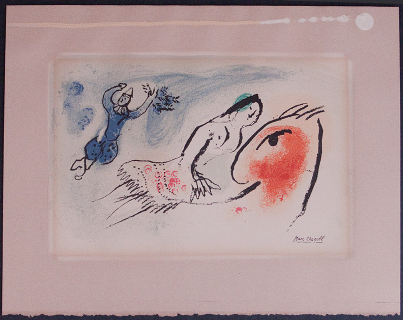
This
is very tragic, but thank God a good samaritan
rescued the art.
This original Marc Chagall lithograph had been
donated to the local library. Many years ago,
somebody made the decision to frame this
irreplaceable art with the cheapest framing solution
available. This included a cheap mdf frame with
standard glass and paper mats. To further insult the
art, the art was glued to the back of the mat.
So,
let's summarize how this art was nearly ruined;
1) The frame was made from a cheap mdf material which
out-gasses formaldehyde (an effective way to dissolve
art),
2) The glass provided no UV radiation protection from
the sun so fading is inevitable,
3) The mat was a cheap paper mat with acids that
leeched into the art and foxing (bacteria) is growing
on the paper,
4) The glue. Sigh, don't even get me started about
the glue.
A biological, chemical and radioactive attack on the
art. A true WMD from an art standpoint.
Friends don't let friends frame drunk.
Be that as it may, it is an amazing piece of
creativity.
Chagall
was
a Jewish Russian-French artist who lived from 1887
until 1985. He was a giant in the art world and an
early innovator of Modernism. It really is inspiring
to examine.
We are working on a new and completely archival frame
design. I will post it when the project is
finished.
Frank the Framer...

Introducing
Frank the Framer. Frank is an interesting persona. To
begin with, he is very friendly and is always smiling
with a warm wink. He cares about his appearance,
judging by the neatly tied bow tie and perfectly
parted hair and he can be both abstract and exact at
the same time and is very colorful.
Over time Frank's purpose will become clear, but
today seemed like a good opportunity to introduce
him.
Today was a good day...
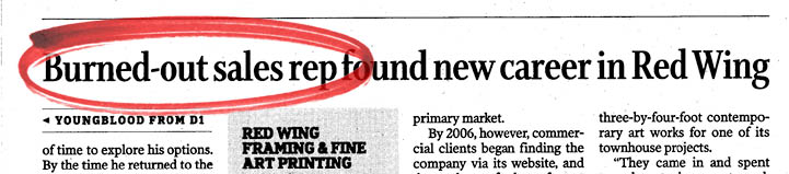
This
morning the Minneapolis Star-Tribune business
columnist Dick Youngblood wrote a very favorable
column about our business here in Red Wing. It was a
lot of fun getting to know Dick over several
conversations and meetings and I really didn't know
what to expect. Needless to say, I was very happy and
a bit embarrassed by the attention.
But it was the sub-headline on the second page of the
hard-copy article that really made me smile. For many
years I thought I was a "washed-up sales rep" when in
fact I was only a "burned-out sales rep". Imagine my
relief.
You gotta love it. :)
The article can be found
here.
Thanks for the article Dick and thanks for the
support Dave and Dean.
Panorama-rama

This time of year creates some beautiful
opportunities for panorama photography. The light is
becoming longer and the trees are just beginning to
turn color. The Mississippi River in particular is a
good panorama subject in this area because there are
plenty of river bluffs to capture the wide expanse of
the river.
The photo above was captured at Buena Vista Park
above Alma, Wisconsin. It is a spectacular overlook.
The weather was borderline inclement, which creates
wonderful atmospheres for the camera lens.
This is a 4:1 print. Large format printing is ideal
for a very narrow print like this. In order to really
appreciate a print like this, it does require some
height to the image, which means it will grow very
wide, very fast. A 12" high print becomes a 48" wide
print. Add some mat (typically 3" all around) and
some moulding, the overall image is nearly 5 feet
wide. This is a 'high drama' image that demands
attention as soon as you walk into the room.
Certified Picture Framer (CPF)
A
Certified Picture Framer (CPF) is a designation
administerd by the Professional Picture Framing
Association (PPFA). The PPFA adminsters the five hour
CPF exam twice a year and tests in the areas of: (1)
art and framing preservation, (2) framing knowledge,
(3) the mechanics of framing, (4) the mathematics of
framing and (5) art and image mounting.
To insure that any framer who has a CPF stays current
in the professional framing field, a CPF must retake
the exam and re-certifiy as a CPF every five years.
This is a very arduous and rigorous process, which is
why very few framers bother becoming CPF's. Red Wing
Framing Gallery is one of only five CPF's actively
working in Minnesota.
We are very proud of the professionalism in which we
address our business and we take our industry very
seriously.
This should be important to any client if their art
is important to them.
Art for hire...
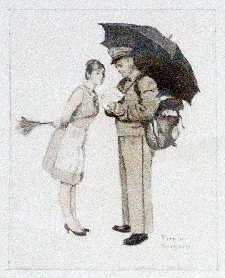
Recently
this Norman Rockwell concept sketch was in the shop
to be re-framed. Rockwell would rough sketch a
proposed painting, present it to a potential client
and solicit feedback. Hopefully he would be awarded
the project, finish the piece, get paid and then move
unto the next project.
Does the fact that an artist is directed what to
paint diminish the art itself? Not at all. Artists
who can support themselves strictly on their own
creative output are rare. And it is a minor step from
an artist taking on a commissioned project to a
full-time commercial illustrator. The net result
might not be an artist's first choice, but finding
opportunity to be creative within the boundaries of a
client's expectations requires both a unique skill
set and maturity as an artist.
This is the segue into an upcoming exhibit that was
just finalized this week. The working title (and it
will change soon) is "Tough Guys and Tough Cookies"
and will be a presentation of original art used for
pulp magazine covers. This art typically presents
scenes of over-the-top drama, usually with somebody
in peril. It is a sub-genre illustration art that
required efficiency and productivity on the part of
the artists. The pay checks were smaller than most of
their colleagues, but it paid the bills and allowed
artists to create art for a living.
This is the third year in a row we have had the
pleasure of working with Grapefruit Moon Gallery. The
first two shows (original pin-up art and original
Cream of Wheat art) were very successful. This will
be a bit different, but consistent with the idea of
presenting 20th century illustration art and various
subsets. More details next week.
New name - new web site - new challenges
People
who invent snappy metaphors to describe business
principles might say something like; a small business
today is like a great white shark, always on the
move, never resting, never sleeping. That sounds way
too contrived, so it would be best to simply say that
a business must constantly ask itself what it does
for a living, and is it where it wants to be in doing
that thing it does.
The name change is more a matter of acknowledging how
this business has evolved. We frame and we print and
we do anything in between. Also it was time to
freshen up the logo; shine our shoes, so to speak.
This was harder than you might think because the
fonts used are fabricated for our needs. It isn't an
off-the-shelf font, but it does have a basis in the
history of this business. But it is too difficult to
explain without hand gestures.
The new web site is another matter. The changes
appear to be mostly cosmetic, but under the hood it
is an entirely different animal. It would take a
rocket scientist to explain the differences and
unfortunately, one isn't immediately availible.
With any new web site, it is very easy to be driven
crazy trying to chase down every image resizing
requirement or some dropped html code. This is called
'overhead' and produces no income. Overhead bad.
Income good.
But, you do what you have to do, when you have to do
it.